
Example of a good CTA
- Right placement
- Explain where it goes
Use of CTA
With the Call To Action we want to persuade the user to take the next step.
Let's take a look at the elements that help convince the user to take the desired action.
Example of a good CTA
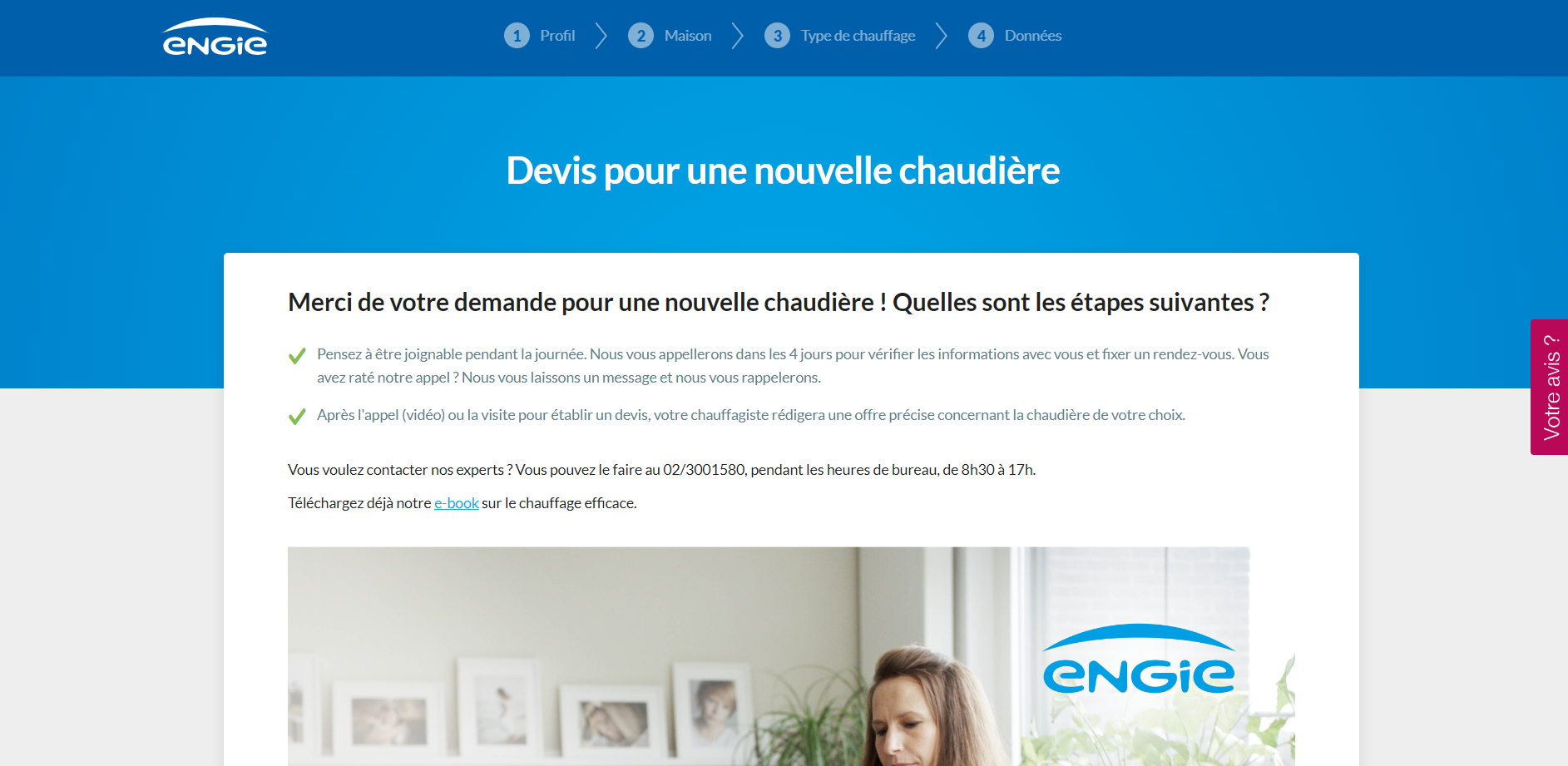
Most of the time you will place the call to action above the fold. However, this doesn’t work for all situations. Sometimes you need more space for convincing and explaining. The idea is that the user has all the confidence he needs to make the intended action. Sometimes a little persuasion around the CTA helps before they take the next step and click, EG giving some more insights, showing trust indicators such as testimonials, …
So, choosing the correct placement starts with knowing your target audience and how much information they need to move forward.
On some pages, you will have more than one CTA. Write out all the CTAs on the page and rank them in order of importance. What is the main goal of the page, and which button offers the highest chance of achieving that goal? Are there any CTAs you should delete? If they aren’t getting click-throughs and aren’t your primary focus, they should go.
Simplify your page and keep the number of CTAs low.
Negative space on your page helps draw attention to the CTA button. Set it off by itself, so the user’s eye lands on it. Remember point 2 and rank your CTAs.
Don’t place two similar CTAs next to each other. Competing for attention. It will confuse the visitor and result in lower conversion rates.
An essential part of this tip is including specific action phrases in your CTA. It may be tempting to use something cute and crafty, but action verbs are what propel the reader to actually take the action that will result in more conversions.
1. Avoid using the third-person tense.
Using the first or second person tense makes your CTA much more conversational like you're talking to a friend. Addressing your visitors like they're already a customer and a part of your company's family is a great way to encourage them to take the actions you want them to take. So, talk to them (second person) or put yourself in their shoes (first person).
2. Create a sense of urgency.
Without a sense of urgency, your audience will have all the right thoughts and intentions of signing up, downloading, contacting you, but won't in the end.
However, creating a sense of urgency doesn't necessarily mean inspiring panic. Offering time-sensitive deals and discounts, a referral incentive, or a sign-up bonus can be a friendly way to create a little urgency on the part of your customers.
UX Copy
UX copy is the language that guides and assists the user to get the best possible experience.
Example of good UX copy
An essential part of this tip is including specific action phrases in your CTAs. It may be tempting to use something cute and crafty but action verbs are what propel the reader to actually take the action that will result in more conversions.
You need to not only tell people what to do but also why they should do it. It's the why that's going to help you increase sales, downloads, submitted contact forms, or whatever your goal for the page happens to be.
One of my favourite rules in business and in life is KISS (keep it simple, seriously). When we overcomplicate things, it throws up unnecessary roadblocks to action. The same comes with the language we use.
In 99% of cases, the simplest way to say something is the best way. Cheeky or flowery language may go viral or be used in most "best of" lists, but the odds that you'll be able to replicate that success are low. It's much better to be simple and straightforward so we're guaranteed to quickly and effectively communicate with users.
While it’s true that UX writers need to pay close attention to microcopy, they can’t ignore the rest of the copy on the site. All site copy comes together to form a complete picture that the user receives when they visit a website. Therefore, when thinking about the writing itself, consider both the microcopy as well as the more long form content. Think about how the two will work hand in hand to convey a complete message.
Don't forget to check the UX governance guidelines